

Challenge
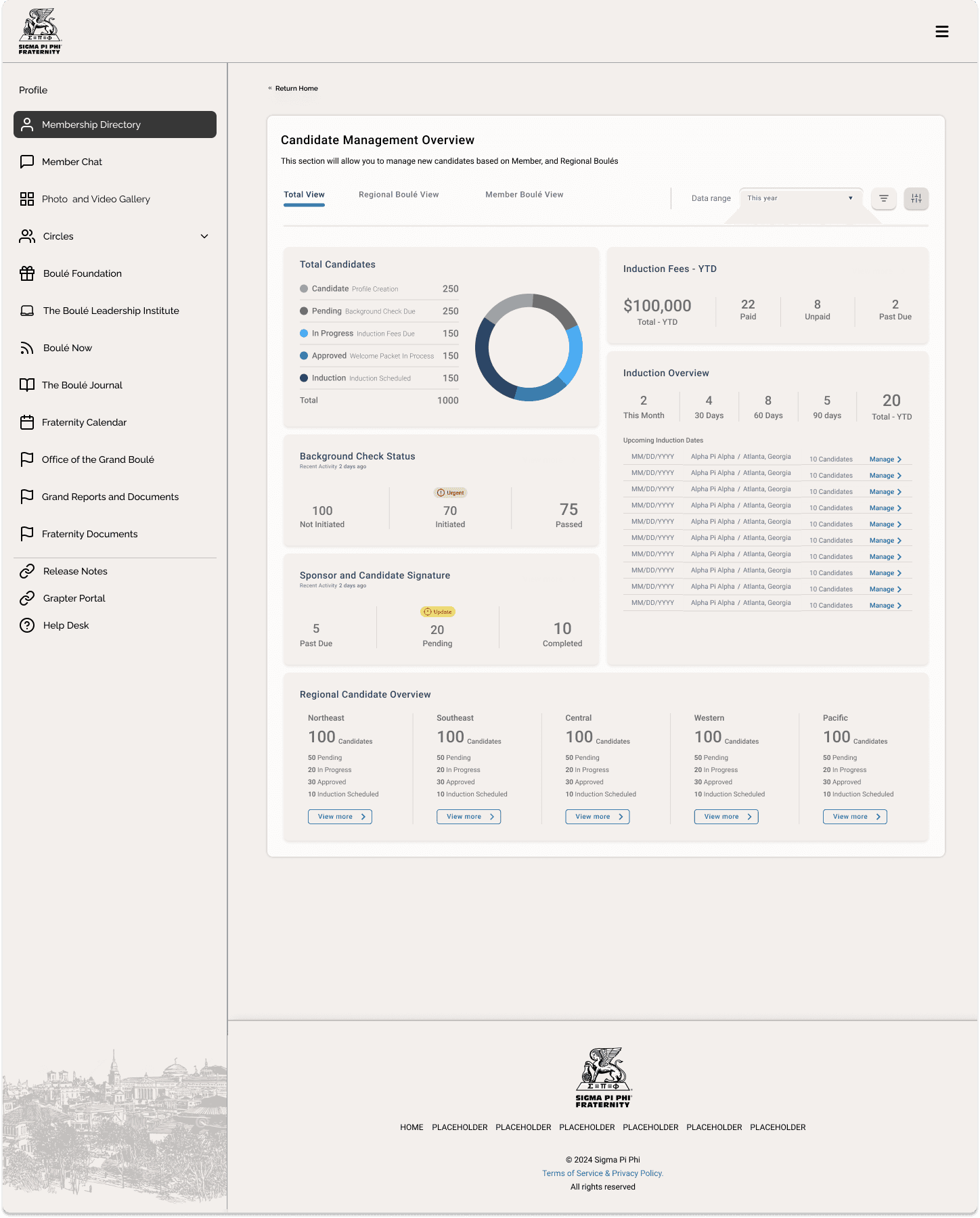
The platform made it difficult for users to understand their financial position and next steps, leading to confusion, low engagement, and inefficient decision-making. The challenge was to improve clarity while maintaining the depth and accuracy of financial data.
Key Insights → Framework
This required aligning design decisions with both business requirements and underlying system constraints to ensure feasibility and scalability.
Insights:
Users overwhelmed by dense financial data
Lack of clear hierarchy and next steps
Misalignment between data and user understanding
Framework:
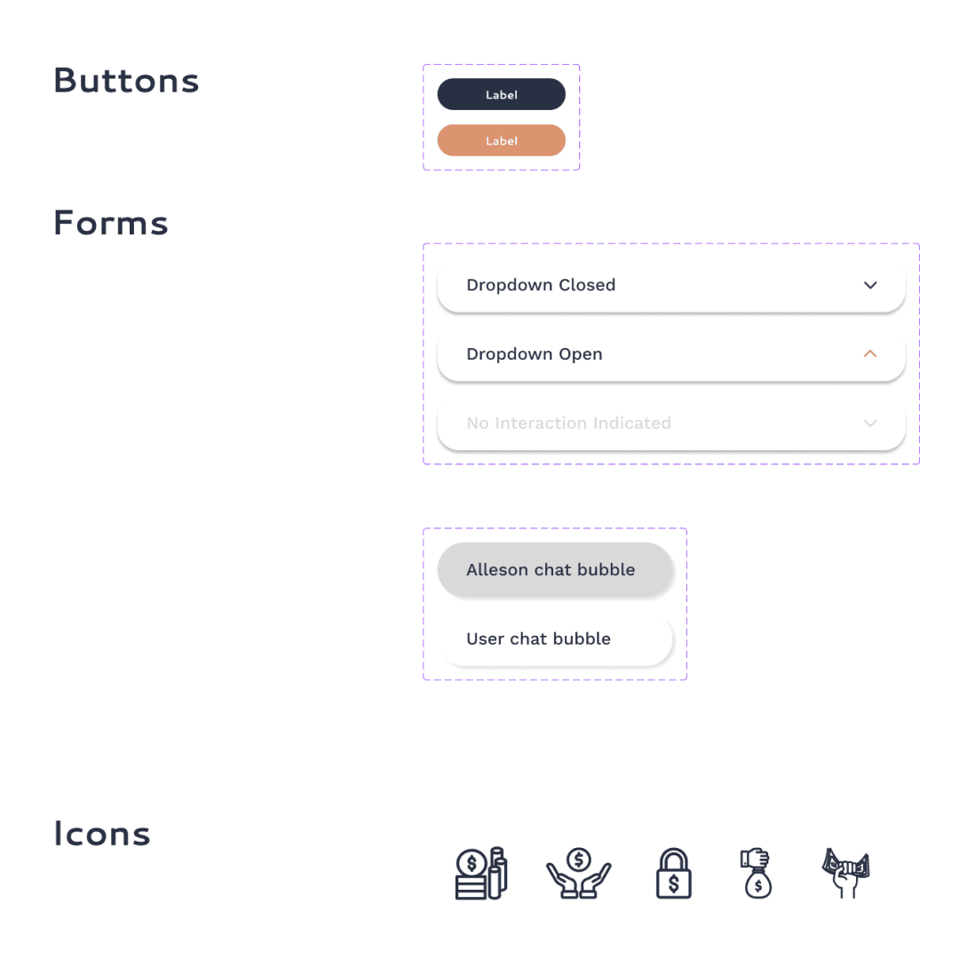
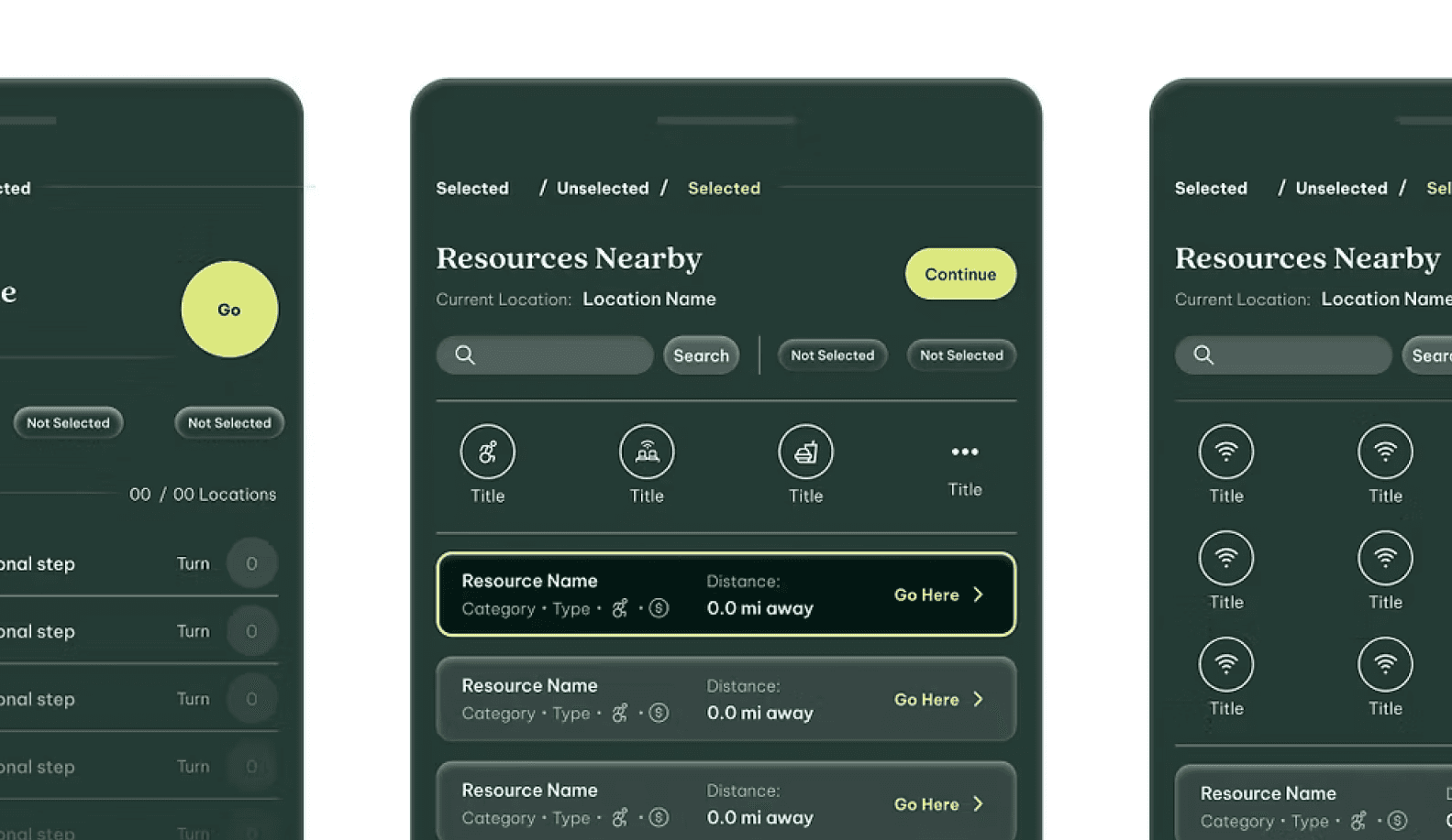
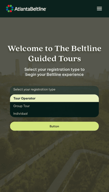
Simplify information hierarchy
Surface key insights first
Guide users toward actionable decisions
This work required rethinking how financial data, system logic, and user understanding aligned—not just improving the interface.
Impact & Outcomes
Shifted the experience from dense and fragmented to structured and decision-oriented, enabling faster, more confident user actions.
Results
Developed a cohesive brand and digital system that unified identity, client journeys, and backend workflows.
Streamlined onboarding processes reduced manual dependency and improved clarity, enabling faster decision-making and more confident user engagement.
Established scalable infrastructure that supported growth while elevating perceived professionalism and trust.
Key Decisions & Tradeoffs
Prioritized clarity over data density
Reduced visual complexity to make key financial insights easier to understand
Structured information hierarchy over flexibility
Simplified navigation and surfaced critical data first to support decision-making
Aligned UI with system logic instead of layering on top
Ensured the experience reflected how financial data is processed and understood
Key Metrics
Reduced visual density by
20%
Increased engagement by
18%
Delivered scalable design systems that reduced manual touchpoints by
80%