
Clarifying Expertise, Trust, and Value Across a Wealth Management Website
Clarifying Expertise, Trust, and Value Across a Wealth Management Website
Clarifying Expertise, Trust, and Value Across a Wealth Management Website
This project focused on improving information architecture, visual hierarchy, and content organization to help prospective clients quickly understand who Avere is, how they help, and why they should trust them with their financial future.
This project focused on improving information architecture, visual hierarchy, and content organization to help prospective clients quickly understand who Avere is, how they help, and why they should trust them with their financial future.
This project focused on improving information architecture, visual hierarchy, and content organization to help prospective clients quickly understand who Avere is, how they help, and why they should trust them with their financial future.

I redesigned Avere Wealth Management's digital presence to create a clearer connection between the firm's expertise, service offerings, and client decision-making journey. The existing website contained strong content, but key messages were competing for attention. Trust signals, service offerings, firm values, and advisor expertise were all present, yet users were
required to work too hard to understand how those pieces connected.
I redesigned Avere Wealth Management's digital presence to create a clearer connection between the firm's expertise, service offerings, and client decision-making journey. The existing website contained strong content, but key messages were competing for attention. Trust signals, service offerings, firm values, and advisor expertise were all present, yet users were
required to work too hard to understand how those pieces connected.
I redesigned Avere Wealth Management's digital presence to create a clearer connection between the firm's expertise, service offerings, and client decision-making journey. The existing website contained strong content, but key messages were competing for attention. Trust signals, service offerings, firm values, and advisor expertise were all present, yet users were required to work too hard to understand how those pieces connected.
18%
Increase in Engagement
Visual Designer
The Challenge
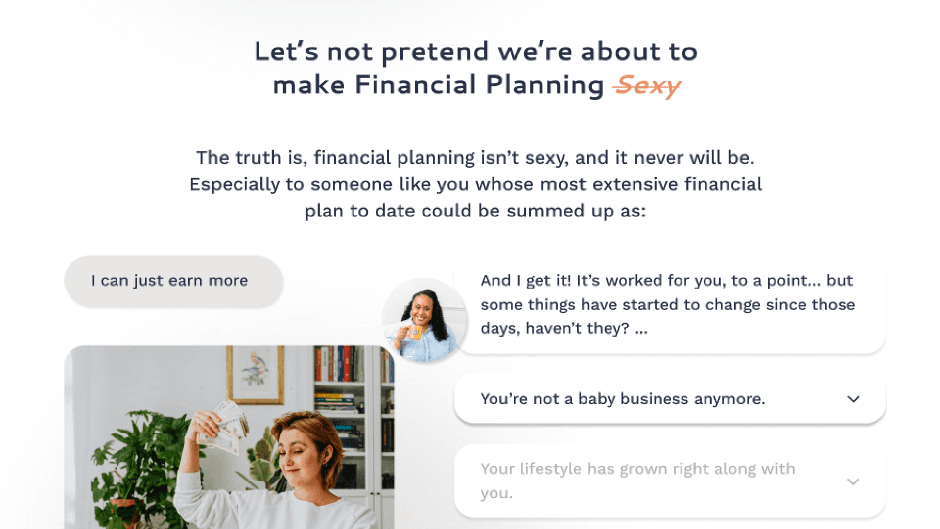
Avere had a trust problem — not with their services, but with how those services were communicated. The website contained everything a prospective client needed to make a confident decision: advisor credentials, firm philosophy, service offerings, and clear next steps. But none of it was organized in a way that supported how people actually evaluate a financial firm.
Everything competed for attention equally. Trust signals sat next to supporting content. Service descriptions carried the same visual weight as credentials. The result was a site that required visitors to work too hard — piecing together a picture of Avere's value instead of having it shown to them clearly.
The challenge wasn't more content. It was making the right content land at the right moment.
Opportunities Identified
A comprehensive site audit surfaced consistent patterns across the experience:


Original Site Audit
Credibility content existed but wasn't doing its job — advisor credentials and trust signals were present but visually undersold, failing to build confidence at the moments it mattered most.
Service offerings were listed but not prioritized — visitors couldn't quickly identify which service applied to them or what the path to engagement looked like.
Page-to-page relationships were unclear — the journey between services, advisor profiles, and contact opportunities felt disconnected rather than intentionally guided.
Increase the prominence of consultation and contact opportunities throughout the experience.
Calls-to-action were consistently secondary — consultation and contact prompts were buried beneath informational content instead of surfacing at natural decision points.
The through-line across all of it: visitors were being asked to interpret the site rather than be led through it. Every opportunity pointed back to the same fix — hierarchy, sequencing, and clarity.
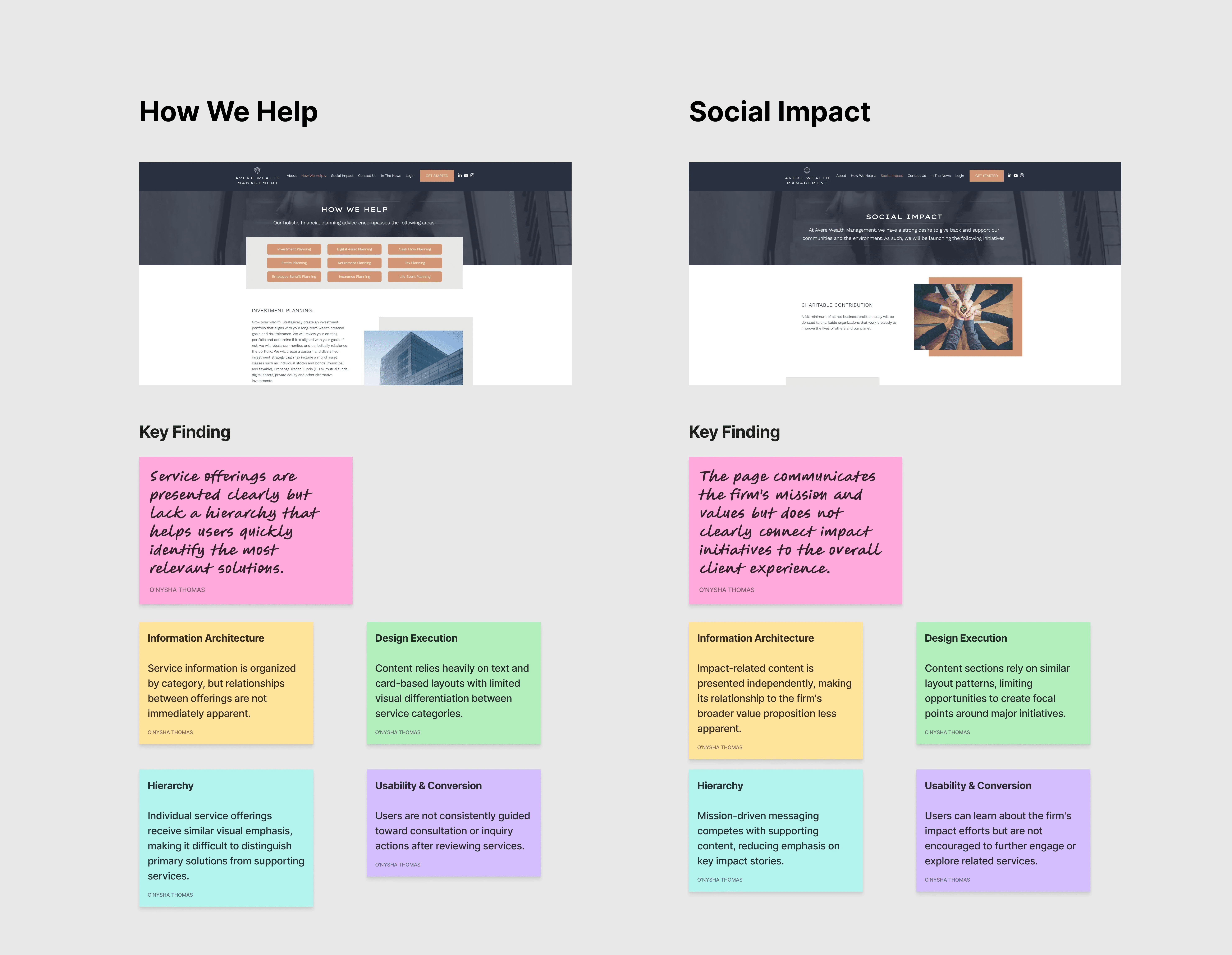
Several patterns emerged throughout the audit:
Credibility-building content existed but lacked sufficient visual emphasis.
Service offerings were clearly listed but not strategically prioritized.
Navigation and content structure did not consistently support user decision-making.
Calls-to-action were present but often secondary to informational content.
Users were frequently asked to interpret relationships between content rather than having those relationships communicated clearly through the experience.
These findings reinforced the importance of hierarchy, clarity, and intentional content organization throughout the redesign.

Key Decisions & Tradeoffs
Shifted the experience from dense and fragmented to structured and decision-oriented, enabling faster, more confident user actions.
Prioritized clarity over data density
Reduced visual complexity to make key financial insights easier to understand
Structured information hierarchy over flexibility
Simplified navigation and surfaced critical data first to support decision-making
Aligned UI with system logic instead of layering on top
Ensured the experience reflected how financial data is processed and understood


Developer Notes/Feedback
Developed a cohesive brand and digital system that unified identity, client journeys, and backend workflows.
Streamlined onboarding processes reduced manual dependency and improved clarity, enabling faster decision-making and more confident user engagement.
Established scalable infrastructure that supported growth while elevating perceived professionalism and trust.

Key Insights
The primary challenge wasn't a lack of information—it was a lack of prioritization.
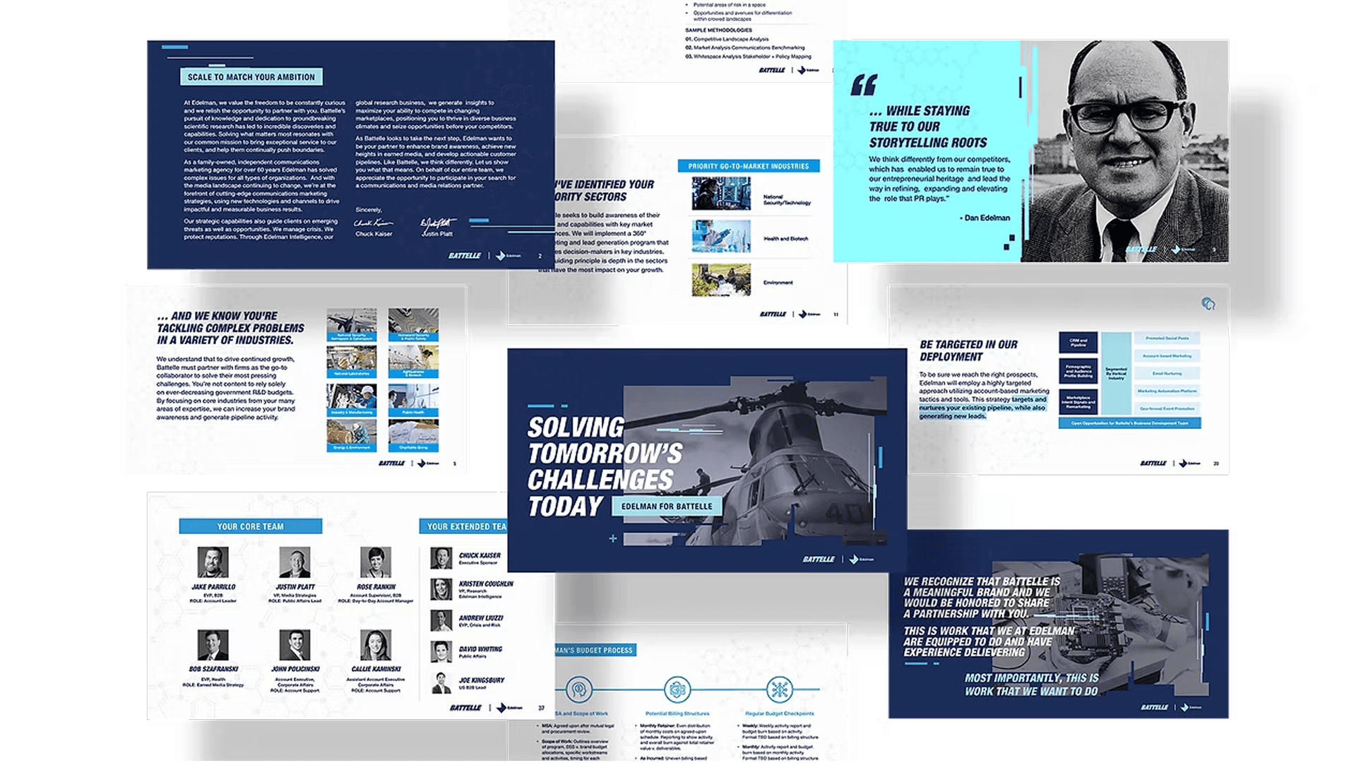
Across the site, important content often competed with supporting content for attention. Prospective clients were required to spend unnecessary effort determining what was most important, how services connected to their needs, and why Avere was uniquely positioned to help.
Results
The redesign measurably improved how prospective clients experienced and engaged with the firm:
20%
reduction in visual density — fewer elements competing for attention, faster comprehension
18%
increase in user engagement across the site
80%
reduction in manual touchpoints through streamlined workflows and clearer self-service paths
The most important lesson from this project was how much damage equal visual weight does to trust. When everything looks equally important, nothing reads as important — and for a wealth management firm, that ambiguity costs conversions. Hierarchy isn't just a design preference. For Avere, it was a business decision.
18%
Increase in Engagement
Visual Designer
The Challenge
The Challenge
Avere had a trust problem — not with their services, but with how those services were communicated. The website contained everything a prospective client needed to make a confident decision: advisor credentials, firm philosophy, service offerings, and clear next steps. But none of it was organized in a way that supported how people actually evaluate a financial firm.
Everything competed for attention equally. Trust signals sat next to supporting content. Service descriptions carried the same visual weight as credentials. The result was a site that required visitors to work too hard — piecing together a picture of Avere's value instead of having it shown to them clearly.
The challenge wasn't more content. It was making the right content land at the right moment.
Avere had a trust problem — not with their services, but with how those services were communicated. The website contained everything a prospective client needed to make a confident decision: advisor credentials, firm philosophy, service offerings, and clear next steps. But none of it was organized in a way that supported how people actually evaluate a financial firm.
Everything competed for attention equally. Trust signals sat next to supporting content. Service descriptions carried the same visual weight as credentials. The result was a site that required visitors to work too hard — piecing together a picture of Avere's value instead of having it shown to them clearly.
The challenge wasn't more content. It was making the right content land at the right moment.
Opportunities Identified
A comprehensive site audit surfaced consistent patterns across the experience:
Original Site Audit
Original Site Audit
Credibility content existed but wasn't doing its job — advisor credentials and trust signals were present but visually undersold, failing to build confidence at the moments it mattered most.
Service offerings were listed but not prioritized — visitors couldn't quickly identify which service applied to them or what the path to engagement looked like.
Page-to-page relationships were unclear — the journey between services, advisor profiles, and contact opportunities felt disconnected rather than intentionally guided.
Increase the prominence of consultation and contact opportunities throughout the experience.
Calls-to-action were consistently secondary — consultation and contact prompts were buried beneath informational content instead of surfacing at natural decision points.
The through-line across all of it: visitors were being asked to interpret the site rather than be led through it. Every opportunity pointed back to the same fix — hierarchy, sequencing, and clarity.
Key Insights
The primary challenge wasn't a lack of information—it was a lack of prioritization.
Across the site, important content often competed with supporting content for attention. Prospective clients were required to spend unnecessary effort determining what was most important, how services connected to their needs, and why Avere was uniquely positioned to help.
Several patterns emerged throughout the audit:
Credibility-building content existed but lacked sufficient visual emphasis.
Service offerings were clearly listed but not strategically prioritized.
Navigation and content structure did not consistently support user decision-making.
Calls-to-action were present but often secondary to informational content.
Users were frequently asked to interpret relationships between content rather than having those relationships communicated clearly through the experience.
These findings reinforced the importance of hierarchy, clarity, and intentional content organization throughout the redesign.

Key Decisions & Tradeoffs
Shifted the experience from dense and fragmented to structured and decision-oriented, enabling faster, more confident user actions.
Prioritized clarity over data density
Reduced visual complexity to make key financial insights easier to understand
Structured information hierarchy over flexibility
Simplified navigation and surfaced critical data first to support decision-making
Aligned UI with system logic instead of layering on top
Ensured the experience reflected how financial data is processed and understood
Developer Notes/Feedback
Developed a cohesive brand and digital system that unified identity, client journeys, and backend workflows.
Streamlined onboarding processes reduced manual dependency and improved clarity, enabling faster decision-making and more confident user engagement.
Streamlined onboarding processes reduced manual dependency and improved clarity, enabling faster decision-making and more confident user engagement.
Established scalable infrastructure that supported growth while elevating perceived professionalism and trust.
Key Insights
The primary challenge wasn't a lack of information—it was a lack of prioritization.
Across the site, important content often competed with supporting content for attention. Prospective clients were required to spend unnecessary effort determining what was most important, how services connected to their needs, and why Avere was uniquely positioned to help.
Results
The redesign measurably improved how prospective clients experienced and engaged with the firm:
20%
reduction in visual density — fewer elements competing for attention, faster comprehension
18%
increase in user engagement across the site
80%
reduction in manual touchpoints through streamlined workflows and clearer self-service paths
The most important lesson from this project was how much damage equal visual weight does to trust. When everything looks equally important, nothing reads as important — and for a wealth management firm, that ambiguity costs conversions. Hierarchy isn't just a design preference. For Avere, it was a business decision.
Developer Notes/Feedback


O'Nysha Thomas
Want to collaborate or strategize with me?
Let’s make something dope together.
Contact Me
Pure O'Nyx © 2026
O'Nysha Thomas
Want to collaborate or strategize with me?
Let’s make something dope together.
Contact Me
Pure O'Nyx © 2026
O'Nysha Thomas
Want to collaborate or strategize with me?
Let’s make something dope together.
Contact Me
Pure O'Nyx © 2026